


RUTH’S MOONSHINE
A BRAND BORN FROM REBELLION — EQUAL PARTS OUTLAW SPIRIT AND SOUTHERN CHARM.
Ruth’s Moonshine isn’t just another craft spirit — it’s a brand built on boldness, outlaw spirit, and a healthy dose of southern grit. When we set out to build Ruth’s identity, we didn’t clean it up — we leaned all the way into the rough edges, rebellious humor, and defiant charm that makes moonshine more than just a drink. It’s a dare.


CASE STUDY DETAILS
Ruth’s Moonshine: A Brand Steeped in Rebellion
Client: Ruth’s Moonshine
-
Create a brand identity for Ruth’s Moonshine — a brand with a rebellious spirit rooted in southern heritage, outlaw culture, and unapologetic authenticity. This wasn’t just another craft spirit. Ruth’s needed to feel bold, dangerous, and deliciously illegal, blending modern design with the brand’s backwoods origins.
-
Moonshine lives in a unique cultural space — both forbidden and irresistible. Ruth’s Moonshine embraces this tension, leaning into the humor and grit of doing something you probably shouldn’t — but absolutely want to.
-
"Sure, it’s illegal. But so are the other things you do."
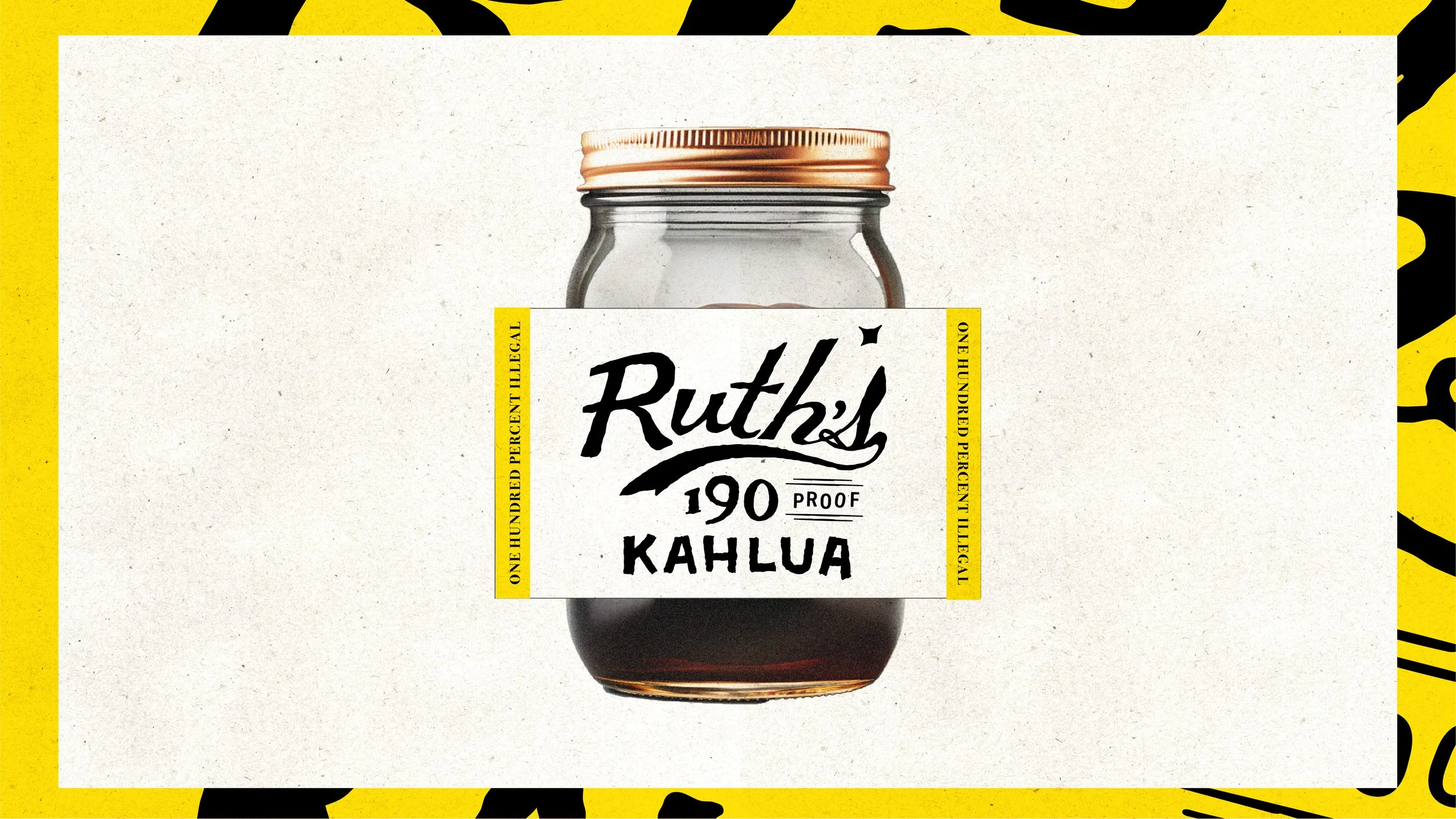
This line became the heartbeat of the brand, capturing Ruth’s playful defiance. Everything — from label design to voice — carries that sly wink. The visuals balance rustic texture with modern typography, and the brand embraces imperfection, rough edges, and a sense of outlaw charm. -
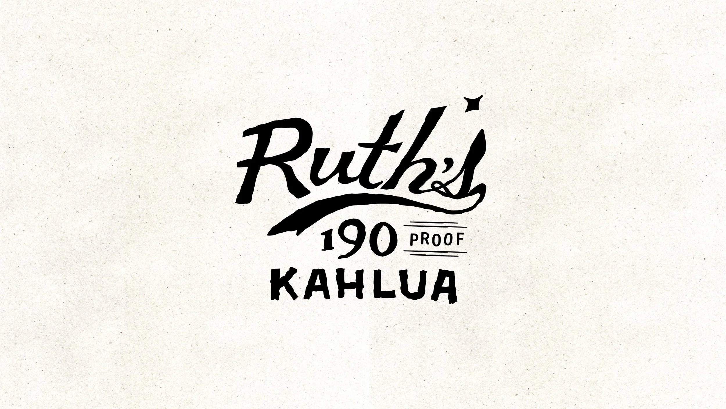
Label System: A layered, hand-touched look, with stark black-and-white typography reminiscent of old wanted posters. The type feels intentionally fractured — a nod to bootlegging’s improvised history.
Brand Voice: Ruth is a character. She speaks directly to the drinker, calling them out with humor, boldness, and a little bit of shade.
Visual Language: Embraces contrast — clean typography against gritty texture — to capture both the quality of the product and its rebellious spirit.
-
The brand’s identity not only stood out on shelves but also created immediate intrigue and conversation. Consumers and retailers alike were drawn to the bold humor and visual confidence. Ruth’s became more than a product — it became a dare.
